

The first label began with mud.
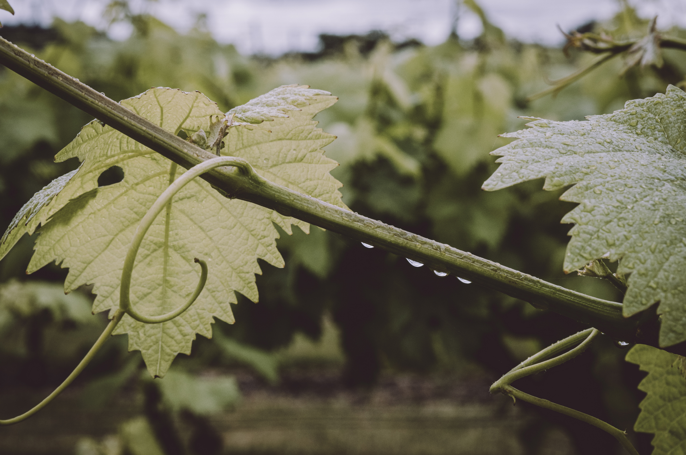
It was January at Westwell, the Kent vineyard Galia runs with her husband Adrian, and the ground was wet enough for the earth to reveal itself. There was not much grass cover, just exposed soil: dark, textured, full of marks and matter. She took a photograph of it and, looking at the image later, saw something more than mud.
“The whole story of what we’re doing is within this soil,” she says.
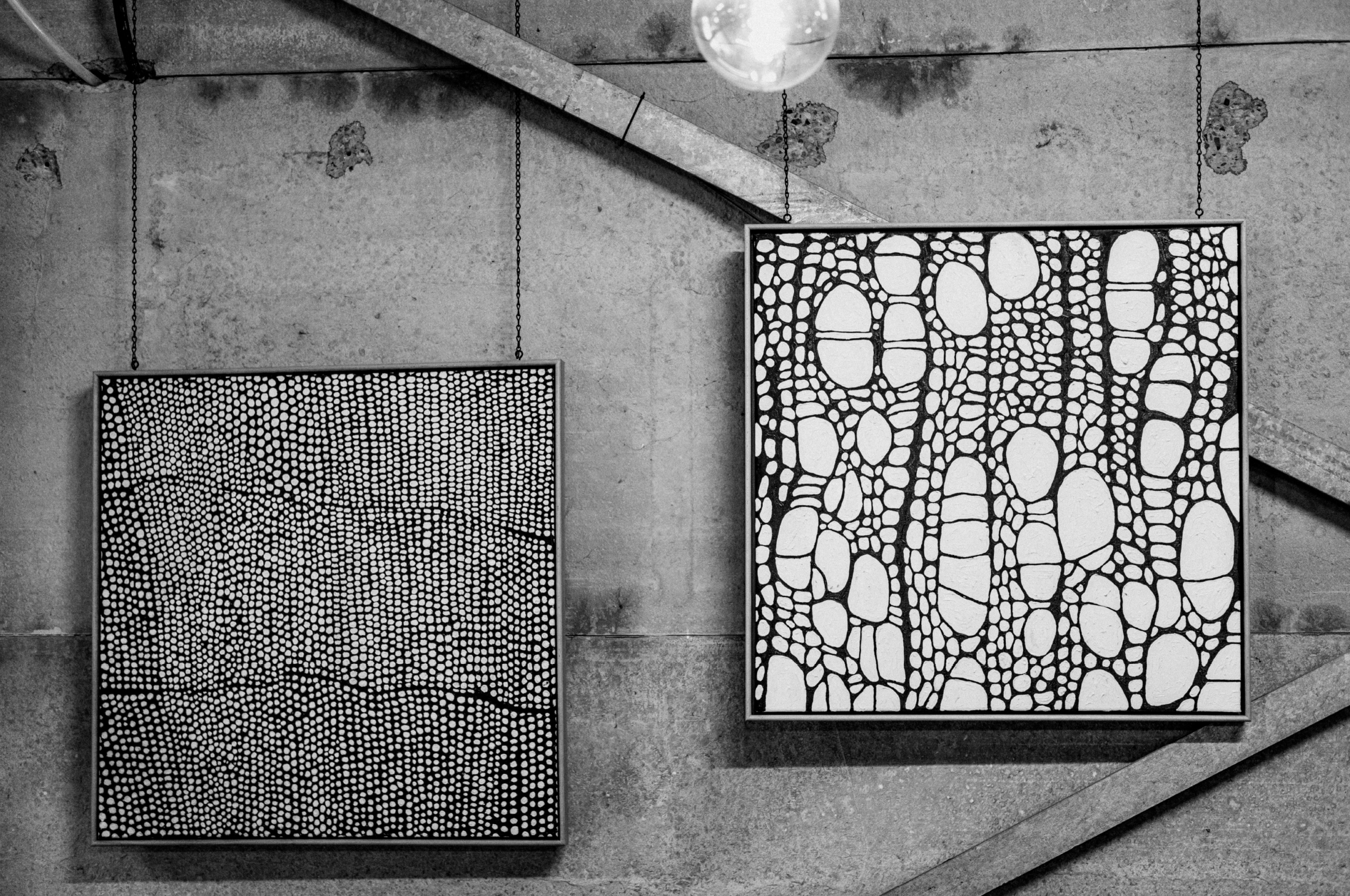
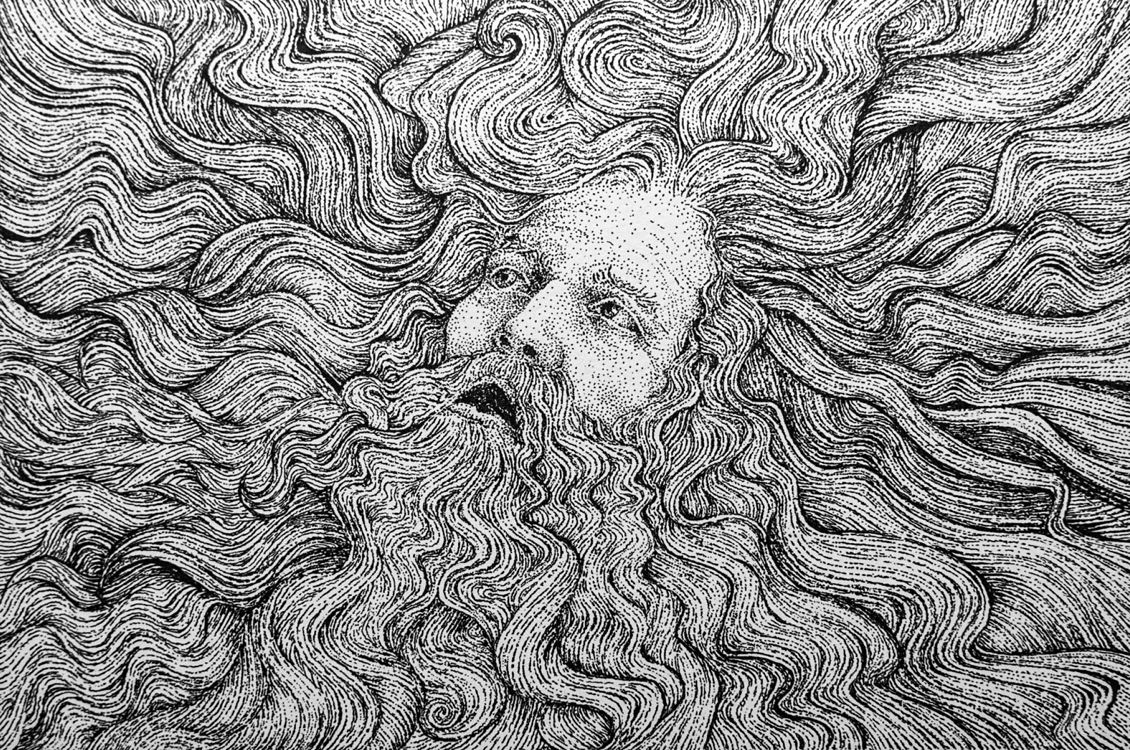
That thought became a drawing. A dense, detailed, black-and-white pen-and-ink illustration, almost obsessive in its attention to texture. It was used for a small release of Ortega made in amphora, a wine produced in such limited quantities that only a few hundred bottles existed. But the drawing did more than dress the bottle. It established a language.
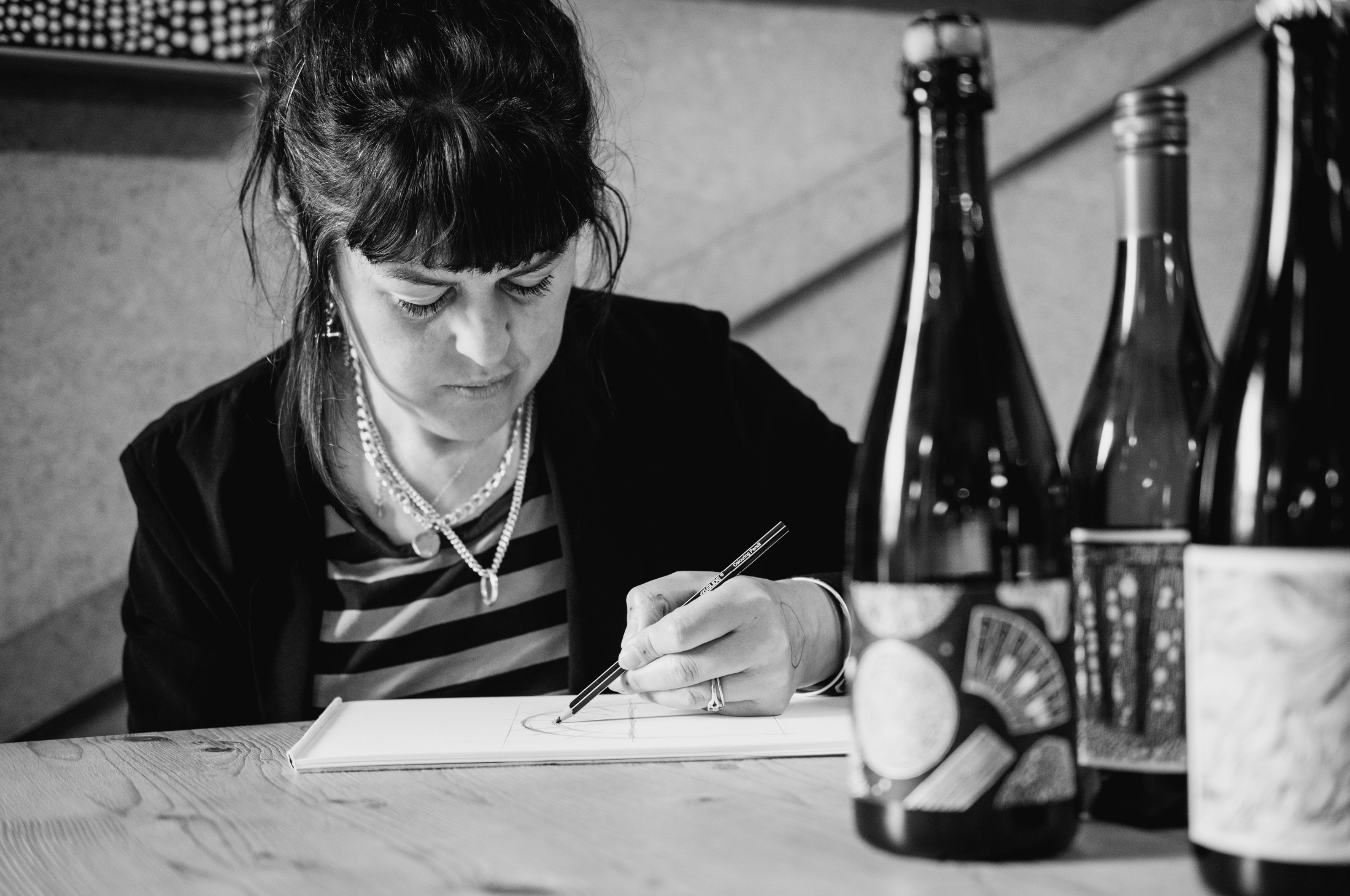
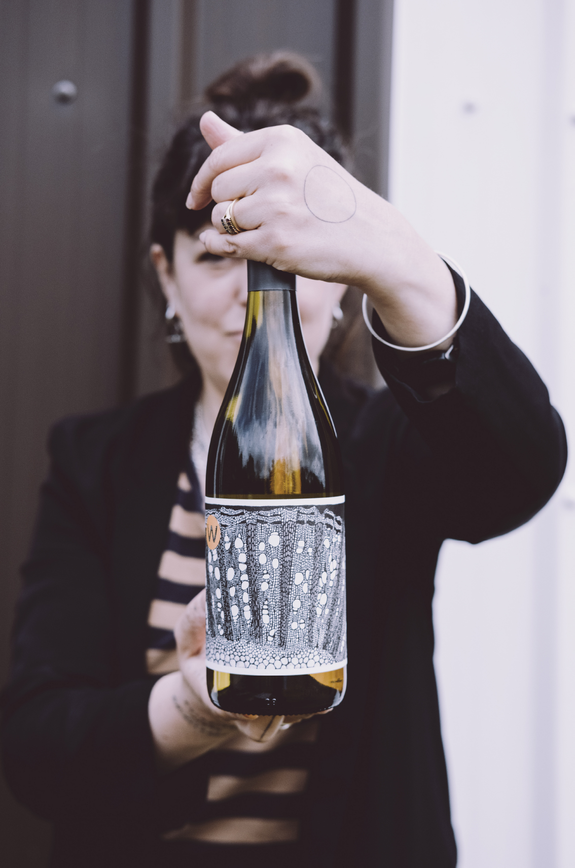
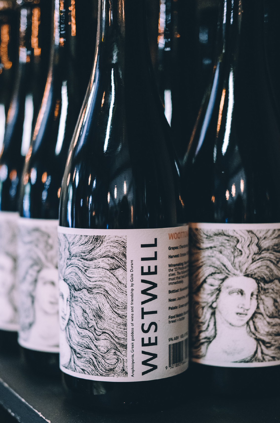
Since then, Westwell’s labels have become among the most recognisable in English wine: intricate, intelligent, strange, beautiful. They do not behave like conventional labels. The vineyard name is not shouting from the front. The wine is not dressed up in the usual visual codes of prestige. Instead, the bottle is wrapped in an image – soil, vine wood, fossil, microscopic forms, mythic figures – and the drinker is invited to turn it in their hands.
The label is not decoration. It is part of the story.
And, like the wines, that story begins with the land.
Westwell sits on the North Downs, on a site that its owners understood quickly was special. It is a place of chalk and flint, of ancient seabed pushed into vineyard, of slow ripening and marginal conditions. English wine, she explains, is not about the high sugars of hotter countries. Its strength lies elsewhere.
“One of the things about growing wine in England,” Galia says, “is that although we don’t have the high sugars in the hotter countries, we have a really slow ripening season. That means the flavour develops. You’ve got a low-alcohol wine, but it’s full of the complexities that you would expect in a world-class wine.”
Harvest can begin in the middle of September, though it often feels later than expected. One year they were still picking at Halloween. Frost, disease pressure, erratic weather, expensive equipment, labour, glass, Brexit, land prices: everything about the business is precarious. She describes winemaking in a marginal climate as “a real kind of madness”.
And yet Westwell has certain advantages. The site is protected. Frost tends to roll along the top of the Pilgrims’ Way and away into another field. The vines are relatively late to bud, often avoiding the most vulnerable frost windows. The soil drains well. The chalk is ideal for vines precisely because it does not give too much.
The most sustainable thing they have done, Galia says, is not a single intervention or piece of technology. It was choosing the right site.
“You want to do the best for the land,” she says. “You want to make the best wine.”
That sense of responsibility runs through our conversation. Galia explains how the land that forms the vineyard is alive with experiments, arguments, failures, jokes, dogs, children, memory lapses and sudden enthusiasms. She describes herself, after some thought, as “contradictory, compulsive and fun”. It is hard to disagree.
Before wine, there was art. And before art came to the fore again, there was music.
Galia went to Chelsea Art College and began on the graphic design side before moving into fine art. Her father, who has since died, was a lecturer in art history and wrote about the Arts and Crafts movement.
He also came up with the concept for the International Design Yearbook, which she describes as a kind of pre-digital Pinterest: a curated annual world of design ideas.
So visual culture was part of the family atmosphere. But art school itself did not quite fit. The freedom of fine art, she says, was almost too much.
“I found the madness and lack of parameters made me go a bit spooky. I think I was overwhelmed with the possibility.”
By then music had become more urgent. She was recording and writing, and by the age of 20 had met her long-term collaborator, Carim Clasmann. Together they made experimental electronic music built from found sound. Building sites were only one source material. They recorded children’s toys, kitchen implements, people’s bodies, animal bones and almost anything else that could produce an interesting sound. At one point they even mic’d up their house and played it like an instrument. Building sites remained a favourite source: they would capture noises – things dropping, smashing, dragging – then isolate those sounds and map them across a keyboard.
“You can basically play a building site on an 88-weighted keyboard,” she says.
The music became stranger and stranger, though it was still anchored by her love of a big chorus. That combination – experimental texture and emotional accessibility – found an audience quickly. Their music was licensed for American television, then one placement became much larger than expected: the theme tune for Grey’s Anatomy.
“It’s the most lucrative 15 minutes of my life,” she says.
The background in music matters because Westwell’s identity still carries that DIY, experimental spirit. It is not rebellious for the sake of it, but neither is it conventional. They are not purists. They are pragmatic. They are not organic, though Marcus Goodwin and the vineyard team think deeply about how they farm. They work with wild yeasts where they can. They experiment. Some wines are knockout. Some go down the drain.
“If you’re going to experiment,” she says, “you have to be prepared to take some risks.”
The labels grew out of that same instinct. They are not a branding exercise imposed from outside. They are another form of making, another way to understand the wine.
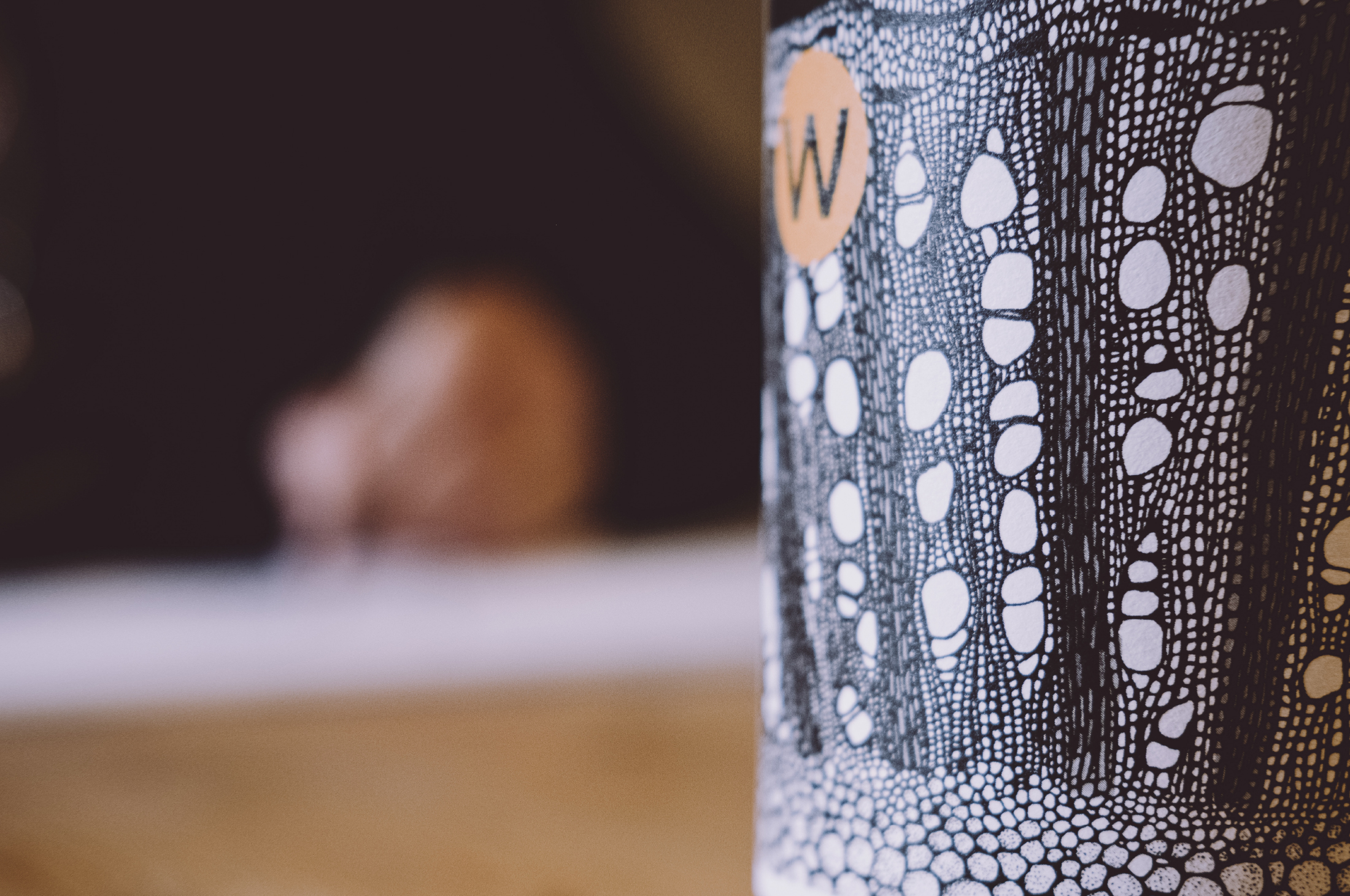
After the soil drawing came vine wood.
She wondered what the material of the vineyard would look like under a microscope. A search led her to a specialist in Switzerland who photographed wood in microscopic detail. She contacted him to ask whether she could draw from some of his images. He replied that if she sent him some of Westwell’s vine wood, he would photograph that instead.
So they cut a small piece of Ortega vine and posted it to Switzerland. The photographs came back and they were beautiful.
“I just drew as honestly as I could,” she says.
That drawing became the label for Ortega, one of Westwell’s core wines. It is still made every year, unlike some of the more experimental releases that shift according to the vintage. The image is cellular and precise. It looks abstract until you understand that it is literal: a piece of the vine, seen differently.
That literalness is important. She laughs about it, but it is part of the power of the work. The labels are not arbitrary patterns. They are drawn from the materials of the vineyard itself.
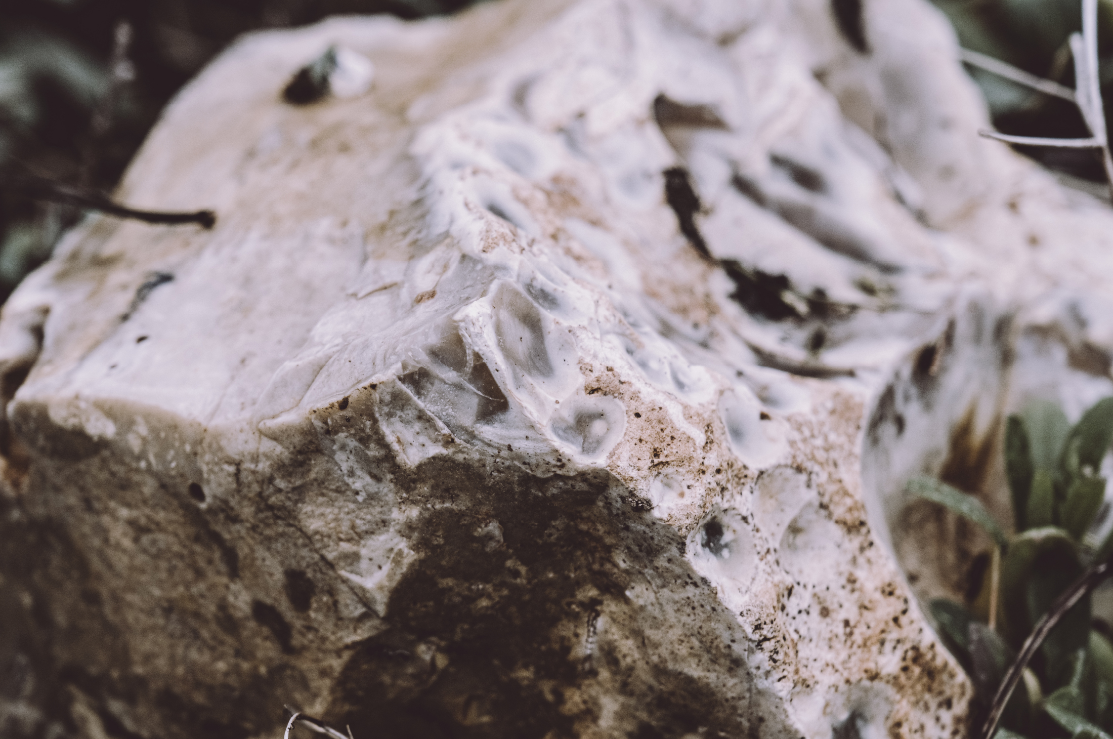
The sparkling labels look deeper still, into chalk.
Westwell’s ground is full of it. Bits of chalk and flint are visible everywhere. Chalk, under a microscope, reveals its origin: tiny fossilised sea creatures, evidence that this land was once under warm, shallow water. The chalk seam runs through Kent, across to France and beyond.
Galia became fascinated by that ancient marine world: diatoms, microscopic organisms, seawater, sand, flint, chalk. The traditional-method sparkling wines carry those references. The drawings are slightly abstracted, with artistic licence, but they are rooted in the geology of the place.
That matters because Westwell is not trying to imitate other sparkling wines.
“We are trying to make wines that taste of Kent,” she says. “That taste of here, of this patch.”
The label, then, becomes a form of terroir. It does visually what the wine is trying to do sensorially. It points not to luxury, but to origin.
For the more unconventional sparkling wines, the labels shift register. Here, we are introduced to figures. Bacchus, the Roman god of wine, appears in various emotional states. One image relates to oxygen exposure, the making process translated into character and movement.
Adrian and I sit together and talk about how the wine was made, what it tastes like, what happened to it, and how that might become an image.
“It’s a joyful thing,” she says.
The labels are part of the conversation at Westwell. They belong to the same world as the farming, the winemaking, the risks and the jokes. They are serious, but not stiff.
That balance might be what makes them work. They invite curiosity without over-explaining themselves. A person picking up a bottle might first be drawn by the image, then begin to wonder what it means. Why chalk? Why microscopic sea creatures? Why vine wood? Why Bacchus? Why no obvious front label?
The answer is that Westwell wants you to look closer. At the bottle, at the land, at the wine, at the hidden structures beneath taste.
Galia’s next obsession is lichen.
We stop by some on the walk and she lights up immediately. The patterns are irresistible to her. Lichen, she says, will become a large-scale painting. After the intense discipline of drawing a small section of a piece over the course of an hour, the appeal of scale is obvious.
“It’s the inverse,” she says.
She likes moving between the micro and the macro: tiny details, big gestures; microscope images, landscape; pen and ink, painting. The two modes inform each other.
Creativity, for her, is not a single practice but a way of being in the world.
That perhaps explains why the labels feel so complete. They are not simply illustrations produced by someone who also happens to own a vineyard. They are the result of a life spent making things: art, music, children, festivals, stories, wines, images. They come from someone who can find beauty in a building site sample, a sliver of vine wood, a chalk fossil, a patch of lichen.
And they come from a vineyard willing to let those things lead.
Westwell’s wines are shaped by weather, chalk, risk, instinct and skill. The labels are shaped by the same forces, only translated into ink. They are not there to make the bottles look pretty, though they do. They are there to reveal the inner life of the wine: the ancient sea beneath the vines, the wood inside the plant, the mud underfoot, the human hand trying to make sense of it all.
The first label began with mud.
It turns out that was exactly the right place to start.